Iklan

Search Engine

Custom Search
Showing posts with label methane. Show all posts

Saturday, May 21, 2016

Arctic Climate Records Melting

An intensely warm winter and spring are melting climate records across Alaska, reports NOAA in the post 'Arctic set for record-breaking melt'. The January-April 2016 period was 11.4°F (6.4°C) warmer than the 20th century average, reports NOAA. The NOAA image below further illustrates the situation.
The sea ice is melting rapidly. Warm water from the Mackenzie River contributes to dramatic melting in the Beaufort Sea, as illustrated by the image below, showing that on May 20, 2016, the Arctic Ocean was 5°F (2.8°C) warmer than in 1981-2011 at the delta of the Mackenzie River.


The image below shows that on May 20, 2016, sea ice extent was 10.99 million square km, compared to the 12.05 million square km extent of the sea ice in May 20, 2012, as measured by JAXA


Sea ice reached a record minimum extent of 3.18 million square km on September 15, 2012, and chances are that the sea ice will be largely gone by September 2016.

The year 2016 is an El Niño year and insolation during the coming months of June and July is higher in the Arctic than anywhere else on Earth. Higher temperatures come with increased danger of wildfires. Greenhouse gases are at record high levels: in April and may, CO2 was about 408 ppm, with hourly peaks as high as 411 ppm (on May 11, 2016). Methane levels are high and rising, especially over the Arctic. Smoke and methane are speeding up sea ice melting, as illustrated by the image below showing smoke from wildfires in Canada extending over the Beaufort Sea (main image), in addition to high methane levels that are present over the Beaufort Sea (inset). 


Ocean heat is also very high and rising. Oceans on the Northern Hemisphere were 0.93°C (or 1.7°F) warmer in the most recent 12-months period (May 2015 through April 2016) than the 20th century average.

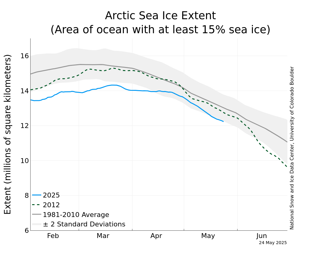
The image below shows sea ice extent as measured by the NSIDC, confirming that melting of the sea ice in 2016 is way ahead on previous years.


Here's an animation comparing sea surface temperatures of the North Atlantic between May 25, 2015, and May 25, 2016.


Arctic sea ice extent was 10.7 million km2 on May 25, 2016, 1.1 million km2 less than it was on May 25, 2012, as the update below shows.


The situation is dire and calls for comprehensive and effective action, as described in the Climate Plan.


Monday, May 16, 2016

Further Confirmation Of Arctic Sea Ice Dramatic Fall

Since early April, 2016, there have been problems with the sensor on the F-17 satellite that provided the data for many Arctic sea ice images. On April 12, NSIDC issued a notice that it had suspended the provision of sea ice updates. On May 6, NSIDC announced that it had completed the shift to another satellite. The red dotted line in the image below shows data from the F-18 satellite from April 1 to May 15, 2016.

The JAXA site also provides sea ice extent images, obtaining data from a Japanese satellite. They show that Arctic sea ice extent on May 15, 2016 was 11,262,361 square km, 1.11 million square km less than it was on May 15, 2012.


The Cryosphere Today is still using data from the F17 satellite, showing some weird spikes. Albert Kallio has taken a recent image and removed faulty spikes, resulting in the image below showing sea ice area up to May 3, 2016.

[ yellow line is 2016, red line is 2015 ]
Importantly, above image confirms that Arctic sea ice in 2016 has indeed been very low, if not at its lowest for the time of the year. Especially since April 2016, sea ice has fallen far below anything we've seen in earlier years. Below, Albert elaborates on comparing data.


by Albert Kallio

REPAIRED USA (F-17) SATELLITE DATA SHOWS RECORD SMALL SEA ICE AREA IN MAY 2016 AGREEING JAPANESE (JAXA) DATA

A corrected Special Sensor Microwave Imager and Sounder (SSMIS) data set on the Defense Meteorological Satellite Program (DMSP) F-17 satellite that provides passive microwave brightness temperatures (and derived Arctic and Antarctic sea ice products) has been corrected here for the system instrumentation error. This agrees with the Japanese JAXA curve, and has been accomplished by removal of the uncharacteristic upward 'ice growth' spikes by linear intrapolation of the corrupt data points. This reinforces the JAXA data that shows the Northern Hemisphere sea ice area is seasonally at new record low which has continued in May 2016.

Smoothened F-17 curve agrees with the Japanese JAXA satellite curve. The reconciliation of the two has been accomplished by removal of the uncharacteristic upward spikes by linear intrapolation of the corrupt days' data points which incorrectly showed immense sea ice area growth in the middle of spring melt season. This reinforces the JAXA data that shows the sea ice area is seasonally at record lows. Therefore, media who are citing recent F-17 satellite sea ice area figures are intentionally distorting the facts with their claims of the Northern Hemisphere having a record sea ice area for this time of season - whereas in reality - the exact opposite has been happening.


Arctic sea ice is in a bad shape and looks set to deteriorate even further, for a number of reasons.

The year 2016 is an El Niño year, as illustrated by the 51.1°C (124.1 °F) forecast for May 22, 2016, over the Indus Valley in Pakistan (see image right).

Insolation during the months June and July is higher in the Arctic than anywhere else on Earth. Greenhouse gases are at record high levels: CO2 was 408.2 ppm on May 12, 2016, and methane levels are high and rising, especially over the Arctic.

Ocean heat is also very high and rising. The image below shows that oceans on the Northern Hemisphere were 0.93°C (or 1.7°F) warmer in the most recent 12-months period (May 2015 through April 2016) than the 20th century average.


The situation is further illustrated by the image below, using the NOAA data with a trendline added that points at a rise of 3°C (5.4°F) before the year 2040.


Chances are that Arctic sea ice will be largely gone by September 2016. As the ice declines, ever more sunlight gets absorbed by the Arctic Ocean. This is one out of numerous feedbacks that are hitting the Arctic. The danger is that, as these feedbacks start to kick in more, heat will reach the seafloor of the Arctic Ocean and trigger methane to be released in huge quantities from the Arctic Ocean seabed.

Recently, an abrupt methane release from the Arctic Ocean seafloor did enter the atmosphere over the East Siberian Sea, showing up with levels as high as 2578 ppb (at 586 mb on May 15, 2016, pm, see image below). Such abrupt releases are indications that methane hydrates are destabilizing and are warnings that climate catastrophe is waiting to happen.


The situation is dire and calls for comprehensive and effective action as described in the Climate Plan.


Monday, May 2, 2016

Wildfire Danger Increasing

Wildfires are starting to break out in British Columbia, Canada. The wildfire on the image below started on May 1, 2016 (hat tip to Hubert Bułgajewski‎).


The coordinates of the wildfire are in the bottom left corner of above map. They show a location where, on May 3, 2016, it was 26.0°C (or 78.8°F). At a nearby location, it was 27.6°C (or 81.8°F) on May 3, 2016. Both locations are indicated on the map on the right.

These locations are on the path followed by the Mackenzie River, which ends up in the Arctic Ocean. Wildfires aggravate heat waves as they blacken the soil with soot. As the Mackenzie River heats up, it will bring warmer water into the Arctic Ocean where this will speed up melting of the sea ice.

Moreover, winds can carry soot high up into the Arctic, where it can settle on the sea ice and darken the surface, which will make that more sunlight gets absorbed, rather than reflected back into space as before.

The danger of wildfires increases as temperatures rise. The image on the right show that temperatures in this area on May 3, 2016 (00:00 UTC) were at the top end of the scale, i.e. 20°C or 36°F warmer than 1979-2000 temperatures.

Extreme weather is becoming increasingly common, as changes are taking place to the jet stream. As the Arctic warms up more rapidly than the rest of the world, the temperature difference between the Equator and the North Pole decreases, which in turn weakens the speed at which the north polar jet stream circumnavigates the globe.

This is illustrated by the wavy patterns of the jet stream in the image on the right, showing the situation on May 3, 2016 (00:00 UTC), with a loop bringing warm air high up into North America and into the Arctic.

In conclusion, warm air reaching high latitudes is causing the sea ice to melt in a number of ways:
  • Warm air makes the ice melt directly. 
  • Warmer water in rivers warms up the Arctic Ocean. 
  • Wildfires blacken land and sea ice, causing more sunlight to be absorbed, rather than reflected back into space as before.  
[ click on images to enlarge ]
The situation doesn't appear to be improving soon, as illustrated by the image on the right. Following the record high temperatures that hit the world earlier this year, the outlook for the sea ice looks bleak.

Further decline of the snow and ice cover in the Arctic looks set to make a number of feedbacks kick in stronger, with methane releases from the seafloor of the Arctic Ocean looming as a huge danger.

NSIDC scientist Andrew Slater has created the chart below of freezing degree days in 2016 compared to other years at Latitude 80°N. See Andrew's website and this page for more on this.
Below is a comparison of temperatures and emissions for the two locations discussed above. Such fires are becoming increasingly common as temperatures rise, and they can cause release of huge amounts of carbon dioxide, carbon monoxide, methane, sulfur dioxide, soot, etc.

May 3, 2016, at a location north of Fort St John, British Columbia, Canada.
May 4, 2016, near Fort McMurray, Alberta, Canada.
The video below shows methane levels (in parts per billion or ppb) on May 3, 2016, pm, starting at 44,690 ft or 13,621 m and coming down to 5,095 ft or 1,553 m altitude. In magenta-colored areas, methane is above 1950 ppb.


In the video below, Paul Beckwith discusses the situation.


Wildfires are also devastating other parts of the Earth. Below is an image showing wildfires over the Amur River on May 7, 2016.


The image below shows carbon monoxide levels over the Amur River as high as 22,480 ppb on May 9, 2016. Hat tip to Grofu Antoniu for pointing at the CO levels. According to this Sputniknews report, a state of emergency was declared in the Amur Region as fires stretched across 12,200 acres.


The video below shows carbon monoxide emissions in eastern Asia from May 1 to May 26, 2016.

Meanwhile, the National Snow and Ice Data Center (NSIDC) has resumed daily sea ice extent updates with provisional data. The image below is dated May 5, 2016, check here for updates.

As illustrated by the image below, from JAXA, sea ice extent on May 6, 2016, was under 12 million square km, more than 15 days ahead on extent in the year 2012, which was 12 million square km on May 21, 2012.


The situation is dire and calls for comprehensive and effective action as described in the Climate Plan.

Malcolm Light comments:

Most natural processes on the Earth are run by convection including plate tectonics that moves the continental and oceanic plates across the surface of the planet. Mother Earth has been able to hold its atmospheric temperature within certain limits and maintain an ocean for more than 3 billion years because each time there was a build up of carbon dioxide in the atmosphere which produced a global fever, Mother Earth it eliminated the living creatures with a massive Arctic methane firestorm that fried them alive. This giant Arctic methane firestorm is a natural antibiotic the Earth uses to rid itself of those creatures that have overproduced carbon dioxide and caused a global fever.

Essentially mankind has again caused a massive build up of fossil fuel carbon dioxide in the atmosphere and Mother Earth has already started to respond with the predicted massive Arctic methane blow out (since 2010) which will lead to an Earth engulfing firestorm in 5 to 8 years.

The giant fires in the Fort McMurray region are a result of atmospheric methane induced heating of the Arctic and 93.5% global warming of the oceans that has generated a massive El Nino event this year. Hot winds moving away from these high pressure areas have generated high temperatures and massive fires in Alberta which is a giant fever spot on Earth where mankind has produced the maximum amount of dirty fossil fuel extraction and pollution in Canada.

Mother Earth will continue to respond more vigorously with her Arctic methane antibiotic to eliminate the humans from her system as we represent nothing more to her than a larger version of an influenza virus which has seriously retarded her oceanic and atmospheric temperature range functioning systems.

If we do not immediately stop fossil fuel extraction worldwide and control the Arctic methane emission sites we will all be stardust before a decade is past.

Related

- The Threat of Wildfires in the North
http://arctic-news.blogspot.com/2013/06/the-threat-of-wildfires-in-the-north.html

- Smoke Blankets North America

Tuesday, April 5, 2016

Record Arctic Warming

On April 3rd, 2016, Arctic sea ice extent was at a record low for the time of the year, reports the National Snow and Ice Data Center (NSIDC).

The image below, created with an image from the JAXA site, gives an update on sea ice extent.


Besides sea ice extent, sea ice area is important. For more on what constitutes "ice-covered" and what is sea ice extent (versus sea ice area), see this NSIDC FAQ page.

Another measure is sea ice area. On April 2nd, 2016, Northern Hemisphere sea ice area was at a record low for the time of the year, reports the Cryosphere Today.


In 2015, there still was more sea ice area than there is now when it was half a month later (15 days) into the year. In 2012, there still was more sea ice when it was 25 days later in the year. In other words, sea ice area decline is almost one month ahead compared with the situation in 2012.

NSIDC scientist Andrew Slater has created the chart below of freezing degree days in 2016 compared to other years at Latitude 80°N. See Andrew's website and this page for more on this.

The Arctic has warmed more than elsewhere on Earth. Surface temperatures over the past 365 days were more than 2.5°C or 4.5°F higher than they were in 1981-2010.


The image below compares sea ice thickness on April 3rd for the years 2012, 2015 and 2016 (respectively the left, center and right panel).


Sea ice thickness has fallen dramatically over the years, as illustrated by the image on the right, from NSIDC, showing Arctic sea ice age for the week from March 4 to 10, from 1985 to 2016.

The high temperatures that have hit the Arctic Ocean over the past 365 days make that the outlook for the sea ice in the Arctic this year is not good.

As illustrated by the image on the right, the current El Niño is still going strong, with temperatures above 100°F recorded in three continents.

The year 2016 is already shaping up as the warmest year on record by far.

Temperatures look set to soar over the coming months, over the Northern Hemisphere at large and over the Arctic in particular.

The image below shows that over a 90-day period from January 13, 2016, to April 11, 2016, most of the Arctic Ocean was more than 6°C (10.8°F) warmer than 1981-2011.

The DMI image below shows recent melting in Greenland up to April 11, 2016. Maps in the left panel show areas where melting has taken place on April 10 and April 11, 2016. The chart in the right panel shows 2016 melting (blue line), against the 1990-2013 average (the vertical axis reflects the percentage of the total area of the ice where the melting occurred).

As a recent study confirms, ice sheets can contain huge amounts of methane in the form of hydrates and free gas. Much methane can escape due to melting and fracturing during wild weather swings.


Rapid melting on Greenland looks set to continue. The forecast for April 12, 2016 (0000 UTC), on the right shows temperature anomalies at the top end of the scale (20°C or 36°F) over most of Greenland and Baffin Bay, while the Arctic as a whole is hit by a temperature anomaly of over 5°C (over 9°F), compared to 1979-2000.

Furthermore, ocean temperatures are currently very high. These high temperatures, together with the poor condition of the sea ice, make that chances are that the sea ice will be largely gone by September 2016.

[ click on images to enlarge them ]
The image on the bottom right shows sea surface temperature anomalies above Latitude 60°N on April 4, 2016.

The image below shows that, on April 7, 2016, sea surface in the Barents Sea was as warm as 10.1°C or 50.2°F, an anomaly of 9.4°C or 16.9°F from 1981-2011 (at the location marked by the top right green circle), while there were anomalies as high as 11.3°C or 20.3°F off the coast of North America (green circle bottom left).

The white line shows the approximate path of the cold exit current, while the red line shows the approximate path of the warm entry current.

The high temperatures in the Barents Sea give an indication of the ocean heat traveling toward the Arctic Ocean, while the high temperature anomalies off the east coast of North America give an indication of the heat that is building up there. Much of this heat will make its way to the Arctic Ocean over the coming months


April 11, 2016: SST anomalies as high as 11.6°C or 20.8°F
In the Pacific, sea surface temperature anomalies from 1981-2011 were as high as 11.6°C or 20.8°F near Japan on April 11, 2016 (see image right), giving a further indication of the huge amount of additional heat that there now is in oceans on the Northern Hemisphere. The prospect is that temperatures will rise over the next few months to levels even higher than they were last year (see earlier post on temperatures in June 2015).

Sea ice acts as a buffer, absorbing heat and keeping the temperature of the water at freezing point. Without such a buffer, further heat will instead make that the temperature of the water will rise rapidly. Furthermore, less sea ice means that less sunlight gets reflected back into space and more sunlight instead gets absorbed by the Arctic Ocean.

These are just some of the many feedbacks that accelerate warming in the Arctic. Warm water reaching the seafloor of the Arctic Ocean can penetrate sediments that can contain huge amounts of methane in the form of hydrates and free gas, triggering abrupt release of methane in gigantic quantities, escalating into runaway warming, and subsequent destruction and extinction at massive scale.

On a 10-year timescale, the current global release of methane from all anthropogenic sources already exceeds all anthropogenic carbon dioxide emissions as agents of global warming; that is, methane emissions are more important than carbon dioxide emissions for driving the current rate of global warming.


Above image shows that growth in methane levels has been accelerating recently; a trendline points at a doubling of methane levels by the year 2040. Unlike carbon dioxide, methane's GWP does rise as more of it is released. Methane's lifetime can be extended to decades, in particular due to depletion of hydroxyl in the atmosphere.

The situation is dire and calls for comprehensive and effective action as described at the Climate Plan.

Albert Kallio comments: 
More could have been added from the last National Snow and Ice Data Center (NSIDC) Arctic sea ice report for March, the general outlook for massive sea ice loss because the near-all-time record low marine snow and ice cover is coinciding with near-all-time record low terrestrial snow cover. NSIDC forecast that due to dark surfaces being so high, this easily leads to loss of sea ice. In fact, 2016 situation is even worse that it was previous record loss 2012 when snow cover was much larger. Same in 2007 when the sea ice area was slighly smaller, there was much larger terrestrial snow cover. Furthermore, neither 2007 nor 2012 occurred during strong El Nino like 1998. El Nino 2015-2016 is the strongest ever, also accompanied by the very warm Indian Ocean, Atlantic Ocean, and Southern Ocean around Antarctica. At times Antarctic sea water temperatures were also high leading to second smallest Austral summer sea ice at one point. Sea ice area also around Antarctica has been smaller than average most of time, despite increased melt water and reduced salinity - due to high temperatures. All these additional factors should be added into your conclusions without forgetting to mention that the added heat in the earth system is ripping the Polar Vortex apart as the jet streams have started to blend into other irregular atmospheric wind patters. Note also the increased flow of sea ice through the Fram Strait due to lowered spatial viscosity of sea ice that also results from larger wave action, vertical mixing of ocean by wind, thinner sea ice breaking easier apart and collapsing into pack ice, as well as being mostly seasonal ice (containing trace amounts of salts that make the chemical bounds in ice crystals weaker and fragile and melting easier), May be you can update and rejoice on NSIDC's March 2016 report noting all the points therein..

On April 3rd, 2016, Arctic sea ice extent was at a record low for the time of the year, further confirming that the...
Posted by Sam Carana on Tuesday, April 5, 2016

Sunday, March 13, 2016

February Temperature


The February 2016 land and ocean temperature anomaly was 1.35°C (2.43°F) above the average temperature in the period from 1951 to 1980, as above image shows (Robinson projection).

On land, it was 1.68°C (3.02°F) warmer in February 2016, compared to 1951-1980, as the image below shows (polar projection).


The image below combines the above two figures in two graphs, showing temperature anomalies over the past two decades.


Below are the full graphs for both the land-ocean data and the land-only data. Anomalies on land during the period 1890-1910 were 0.61°C lower compared to the period from 1951 to 1980, which is used as a reference to calculate anomalies. The blue line shows land-ocean data, while the red line shows data from stations on land only.


At the Paris Agreement, nations committed to strengthen the global response to the threat of climate change by holding the increase in the global average temperature to well below 2°C above pre-industrial levels and to pursue efforts to limit the temperature increase to 1.5°C above pre-industrial levels.

To see how much temperatures have risen compared to pre-industrial levels, a comparison with the period 1951-1980 does not give the full picture. The image below compares the February 2016 temperatures with the period from 1890 to 1910, again for land only.


Since temperatures had already risen by ~0.3°C (0.54°F) before 1900, the total temperature rise on land in February 2016 thus is 2.6°C (4.68°F) compared to the start of the industrial revolution.

There are a number of elements that determine how much the total temperature rise on land will be, say, a decade from now:

Rise 1900-2016: In February 2016, it was 2.3°C (4.14°F) warmer on land than it was in 1890-1910.

Rise before 1900: Before 1900, temperature had already risen by ~0.3°C (0.54°F), as Dr. Michael Mann points out (see earlier post).

Rise 2016-2026: If levels of carbon dioxide and further greenhouse gases do keep rising, there will additional warming over the next ten years. Even with dramatic cuts in carbon dioxide emissions, temperatures can keep rising, as maximum warming occurs about one decade after a carbon dioxide emission, so the full wrath of the carbon dioxide emissions over the past ten years is still to come. Moreover, mean global carbon dioxide grew by 3.09 ppm in 2015, more than in any year since the record started in 1959, prompting an earlier post to add a polynomial trendline that points at a growth of 5 ppm by 2026 (a decade from now). This growth took place while global energy-related CO2 emissions have hardly grown over the past few years, indicating that land and oceans cannot be regarded as a sink, but should be regarded as source of carbon dioxide. On land, carbon dioxide may be released due to land changes, changes in agriculture, deforestation and extreme weather causing droughts, wildfires, desertification, erosion and other forms of soil degradation. Importantly, this points at the danger that such emissions will continue to grow as temperatures keep rising. New studies on permafrost melt (such as this one and this one) show that emissions and temperatures can rise much faster in the Arctic than previously thought. Furthermore, a 2007 study found a 25% soil moisture reduction to result in 2°C warming. Altogether, the rise over the next decade due to such emissions may be 0.2°C or 0.36°F (low) to 0.5°C or 0.9°F (high).

Removal of aerosols: With the necessary dramatic cuts in emissions, there will also be a dramatic fall in aerosols that currently mask the full warming of greenhouse gases. From 1850 to 2010, anthropogenic aerosols brought about a decrease of ∼2.53 K, says a recent paper. In addition, more aerosols are likely to be emitted now than in 2010, so the current masking effect of aerosols may be even higher. Stopping aerosol release may raise temperatures by 0.4°C or 0.72°F (low) to 2.5°C or 4.5°F (high) over the next decade, and when stopped abruptly this may happen in a matter of weeks.

Albedo change: Warming due to Arctic snow and ice loss may well exceed 2 W per square meter, i.e. it could more than double the net warming now caused by all emissions by people of the world, as Professor Peter Wadhams calculated in 2012. The temperature rise over the next decade due to albedo changes as a result of permafrost and sea ice decline may be 0.2°C or 0.36°F (low) to 1.6°C or 2.9°F (high).

Methane eruptions from the seafloor: ". . . we consider release of up to 50 Gt of predicted amount of hydrate storage as highly possible for abrupt release at any time," Dr. Natalia Shakhova et al. wrote in a paper presented at EGU General Assembly 2008. Authors found that such a release would cause 1.3°C warming by 2100. Such warming from an extra 50 Gt of methane seems conservative when considering that there now is only some 5 Gt of methane in the atmosphere, and over a period of ten years this 5 Gt is already responsible for more warming than all the carbon dioxide emitted by people since the start of the industrial revolution. The temperature rise could be higher, especially in case of large abrupt release, but in case of small and gradual releases much of the methane may be broken down over the years. The temperature rise due to seafloor methane over the next decade may be 0.2°C or 0.36°F (low) to 1.1°C or 2°F (high).

Water vapor feedback:
 "Water vapour feedback acting alone approximately doubles the warming from what it would be for fixed water vapour. Furthermore, water vapour feedback acts to amplify other feedbacks in models, such as cloud feedback and ice albedo feedback. If cloud feedback is strongly positive, the water vapour feedback can lead to 3.5 times as much warming as would be the case if water vapour concentration were held fixed", according to the IPCC. In line with the above elements, this may result in a temperature rise over the next decade of 0.2°C or 0.36°F (low) to 2.1°C or 3.8°F (high).

The image below puts all these elements together in two scenarios, one with a relatively low temperature rise of 3.9°C (7.02°F) and another one with a relatively high temperature rise of 10.4°C (18.72°F).


Note that the above scenarios assume that no geoengineering will take place.

The 2.3°C warming used in above image isn't the highest figure offered by the NASA site. An even higher figure of 2.51°C warming can be obtained by selecting a 250 km smoothing radius for the on land data.

When adding the 0.3°C that temperatures rose before 1900, the rise from the start of the industrial revolution is 2.81°C (5.06°F), as illustrated by the image on the right.

The image also shows that this is the average rise. At specific locations, it is as much as 16.6°C (30°F) warmer than at the start of the industrial revolution.

Furthermore, temperatures are higher on the Northern Hemisphere than on the Southern Hemisphere. This is illustrated by the image below showing NASA temperature anomalies for January 2016 (black) and February 2016 (red) on land on the Northern Hemisphere. The data show that it was 2.36°C (4.25°F) warmer in February 2016 compared to 1951-1980.


How much of the rise can be attributed to El Niño? The added trendlines constitute one way to handle variability such as caused by El Niño and La Niña events and they can also indicate how much warming could be expected to eventuate over the years to come.

The February trendline also indicates that the temperature was 0.5°C lower in 1900 than in 1951-1980, so the total rise from 1900 to February 2016 is 2.86°C (5.15°F). Together with a 0.3°C rise before 1900, this adds up to a rise on land on the Northern Hemisphere of 3.16°C (5.69°F) from pre-industrial levels to February 2016. Most people on Earth live on land on the Northern Hemisphere. In other words, most people are already exposed to a temperature rise that is well above any guardrails that nations at the Paris Agreement pledged would not be crossed.


Temperatures may actually rise even more rapidly than these trendlines indicate. As above image illustrates, the largest temperature rises are taking place in the Arctic, resulting in a rapid decline of snow and ice cover and increasing danger that large methane eruptions from the seafloor will take place, as illustrated by the image on the right, from an earlier post. This could then further lead to more water vapor, while the resulting temperature rises also threaten to cause more droughts, heatwaves and wildfires that will cause further emissions, as well as shortages of food and fresh water supply in many areas.

Adding the various elements as discussed above indicates that most people may well be hit by a temperature rise of 4.46°C or 8.03°F in a low rise scenario and of 10.96°C or 19.73°F in a high rise scenario, and that would be in one decade from February 2016. Since it is now already March 2016, that is less than ten years from now.

The image below shows highest mean methane readings on one day, i.e. March 10, over four years, i.e. 2013, 2014, 2015 and 2016, at selected altitudes in mb (millibar). The comparison confirms that the increase of methane in the atmosphere is more profound at higher altitudes, as discussed in earlier posts. This could indicate that methane from the Arctic Ocean is hardly detected at lower altitudes, as it rises in plumes (i.e. very concentrated), while it will then spread and accumulate at higher altitudes and at lower latitudes.


The conversion table below shows the altitude equivalents in mb, feet and m.

57016 feet44690 feet36850 feet30570 feet25544 feet19820 feet14385 feet 8368 feet1916 feet
17378 m13621 m11232 m 9318 m 7786 m 6041 m 4384 m 2551 m 584 m
 74 mb 147 mb 218 mb 293 mb 367 mb 469 mb 586 mb 742 mb 945 mb

Meanwhile Arctic sea ice area remains at a record low for the time of the year, as illustrated by the image below.


Next to rising surface temperatures in the Arctic, ocean temperature rises on the Northern Hemisphere also contribute strongly to both Arctic sea ice decline and methane releases from the seafloor of the Arctic Ocean, so it's important to get an idea how much the Northern Hemisphere ocean temperature can be expected to rise over the next decade. The NOAA image below shows a linear trend over the past three decades that is rising by 0.19°C per decade.

The image below, using the same data, shows a polynomial trend pointing at a 1.5°C rise in ocean temperature on the Northern Hemisphere over the next decade.


Below is an interactive version of the graph.
The situation is dire and calls for comprehensive and effective action, as described in the Climate Plan.


There are a number of elements that determine how much the total temperature rise on land will be, say, a decade from...
Posted by Sam Carana on Sunday, March 13, 2016